PROJECT HIGHLIGHT with HARRIET GORDON
We explore Harriet Gordon’s playful country house & get to know the designer behind the space…
Tell us about your background in the design industry, what led you to start your own studio?
Of course! I had previously been lucky enough to work in London and New York for some truly cutting edge and fashion forward brands, the likes of Topshop, Ruby & Millie and Cowshed. This was a memorable time that allowed me to be fully immersed in the latest trends and develop my understanding of the power of colour and texture.
After taking some time off to have my daughters, I was looking for a creative outlet again. I embarked on a home renovation of an East London workman’s cottage, followed immediately by another more ambitious one for a Victoria Park townhouse. I was hooked! I was reminded how important a space is to your sense of identity and general mood.
During the pandemic I returned to college with an Interior Design course at KLC. It was intense but I loved it, I think I drank more coffee and lost more sleep over it than my A levels and university degree combined!
Where do you look to for design inspiration?
Anywhere and everywhere! Travel is a great source of inspiration. When I arrive at a new hotel the first thing I do is check out the bathrooms. This can be a hard space to design so I like to see what materials and lighting are used and if they still have warmth and character.
I just got back from a road trip across California and into Arizona and Utah. The Beverly Hills Hotel gave me a serious green and pink crush, Palm Springs took me down a modernist worm hole, then the orange and pink rocks of Sedona combined with the blue sky made me want to use these tones together as soon as possible. Nature always finds the perfect colour combinations and is a great place to be inspired. Equally I love to look and follow some favourite designers. On the same trip I visited the new Kelly Wearstler designed Ulla Johnson store in LA. I didn’t know whether to look at the clothes or the setting. It was an incredible mix of textures, sculpture, hand crafted art and native plants. A mix of so many elements but still light and effortless, that’s the genius!
Tell us about the project, what was your favourite part of the design process?
This was the first time I had worked on a country house but also not a period house typical of London; both of which allowed me to make more playful design choices and add a sense of whimsy. I loved that it was not defined by a particular style, being almost Lutyens from the exterior, inside evoked at times Art and Crafts and at others country cottage.
I appreciated working on a larger more lateral space. Victorian homes can often feel narrow and constrained, but with a few interior tweaks this space easily created a wonderful sense of flow, with a central kitchen and living space opening up to some beautiful sightlines in all directions.
‘Modern crafted’ was the overarching theme threaded through the central spaces. With this in mind, A RUM FELLOW was the perfect fit!
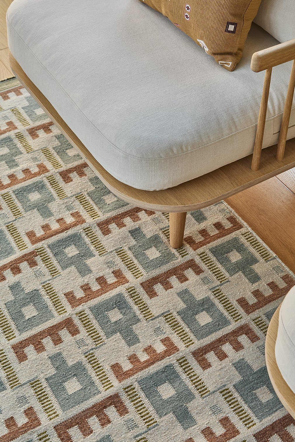
Most notably in the living room where, tucked away from main sightlines, a custom colour HIKIRA rug served as the starting point for a more playful space. I love how it is both dramatic on its own, but also anchors the warmer tones and soft structural shapes of the pieces placed upon it.
Photography by: Natalie Dinham


